
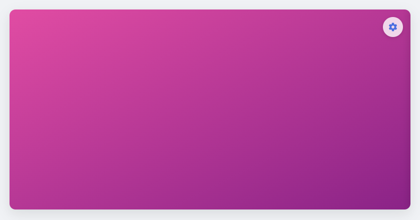
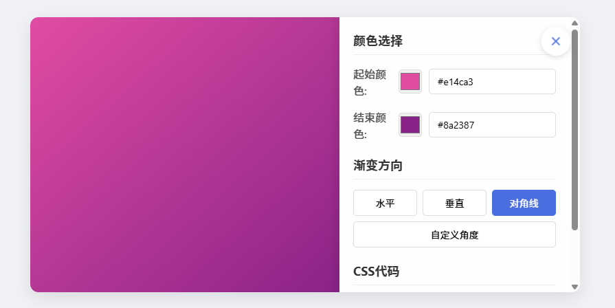
直接将代码另存为双色渐变背景.HTML文件,打开就能用。效果如下图:
<!DOCTYPE html>
<html lang="zh-CN">
<head>
<meta charset="UTF-8">
<meta name="viewport" content="width=device-width, initial-scale=1.0">
<title>双色渐变背景控制器</title>
<style>
* {
margin: 0;
padding: 0;
box-sizing: border-box;
font-family: 'Segoe UI', Tahoma, Geneva, Verdana, sans-serif;
}

body {
display: flex;
justify-content: center;
align-items: center;
min-height: 100vh;
background: #f0f2f5;
padding: 20px;
}

.gradient-container {
position: relative;
width: 90%;
max-width: 800px;
height: 400px;
border-radius: 12px;
box-shadow: 0 8px 25px rgba(0, 0, 0, 0.1);
overflow: hidden;
transition: all 0.3s ease;
}

.gradient-preview {
width: 100%;
height: 100%;
display: flex;
justify-content: center;
align-items: center;
transition: all 0.3s ease;
}

.control-toggle {
position: absolute;
top: 15px;
right: 15px;
width: 40px;
height: 40px;
background: rgba(255, 255, 255, 0.8);
border: none;
border-radius: 50%;
display: flex;
justify-content: center;
align-items: center;
cursor: pointer;
box-shadow: 0 2px 8px rgba(0, 0, 0, 0.15);
transition: all 0.3s ease;
z-index: 10;
}

.control-toggle:hover {
background: rgba(255, 255, 255, 0.95);
transform: scale(1.05);
}

.control-toggle svg {
width: 20px;
height: 20px;
fill: #4a6ee0;
}

.control-panel {
position: absolute;
top: 0;
right: -350px;
width: 350px;
height: 100%;
background: rgba(255, 255, 255, 0.95);
backdrop-filter: blur(10px);
padding: 20px;
transition: all 0.4s ease;
overflow-y: auto;
box-shadow: -5px 0 15px rgba(0, 0, 0, 0.1);
}

.control-panel.active {
right: 0;
}

.gradient-preview.controls-active {
width: calc(100% - 350px);
}

.control-group {
margin-bottom: 20px;
}

.control-group h3 {
margin-bottom: 15px;
color: #333;
font-size: 18px;
border-bottom: 1px solid #eee;
padding-bottom: 8px;
}

.color-control {
display: flex;
align-items: center;
margin-bottom: 15px;
}

.color-control label {
width: 100px;
font-weight: 500;
color: #555;
}

.color-control input[type="color"] {
width: 50px;
height: 35px;
border: 1px solid #ddd;
border-radius: 5px;
cursor: pointer;
margin-right: 10px;
}

.color-control input[type="text"] {
flex: 1;
padding: 8px 12px;
border: 1px solid #ddd;
border-radius: 5px;
font-size: 14px;
}

.direction-control {
display: flex;
gap: 8px;
flex-wrap: wrap;
}

.direction-btn {
flex: 1;
min-width: 70px;
padding: 8px 5px;
background: white;
border: 1px solid #ddd;
border-radius: 5px;
cursor: pointer;
text-align: center;
transition: all 0.2s;
font-size: 14px;
}

.direction-btn:hover {
background: #f5f5f5;
}

.direction-btn.active {
background: #4a6ee0;
color: white;
border-color: #4a6ee0;
}

.angle-control {
display: flex;
align-items: center;
gap: 10px;
}

.angle-control input[type="range"] {
flex: 1;
}

.angle-value {
width: 40px;
text-align: center;
font-weight: bold;
font-size: 14px;
}

.code-preview {
background: #2d2d2d;
color: #f8f8f2;
padding: 12px;
border-radius: 5px;
font-family: 'Courier New', monospace;
font-size: 13px;
margin-top: 10px;
overflow-x: auto;
}

@media (max-width: 768px) {
.gradient-container {
height: 350px;
}

.control-panel {
width: 300px;
right: -300px;
}

.gradient-preview.controls-active {
width: calc(100% - 300px);
}
}

@media (max-width: 480px) {
.gradient-container {
height: 300px;
}

.control-panel {
width: 280px;
right: -280px;
}

.gradient-preview.controls-active {
width: calc(100% - 280px);
}
}
</style>
</head>
<body>
<div class="gradient-container">
<div class="gradient-preview" id="gradientPreview">
<button class="control-toggle" id="controlToggle">
<svg viewBox="0 0 24 24">
<path d="M12,15.5A3.5,3.5 0 0,1 8.5,12A3.5,3.5 0 0,1 12,8.5A3.5,3.5 0 0,1 15.5,12A3.5,3.5 0 0,1 12,15.5M19.43,12.97C19.47,12.65 19.5,12.33 19.5,12C19.5,11.67 19.47,11.34 19.43,11L21.54,9.37C21.73,9.22 21.78,8.95 21.66,8.73L19.66,5.27C19.54,5.05 19.27,4.96 19.05,5.05L16.56,6.05C16.04,5.66 15.5,5.32 14.87,5.07L14.5,2.42C14.46,2.18 14.25,2 14,2H10C9.75,2 9.54,2.18 9.5,2.42L9.13,5.07C8.5,5.32 7.96,5.66 7.44,6.05L4.95,5.05C4.73,4.96 4.46,5.05 4.34,5.27L2.34,8.73C2.22,8.95 2.27,9.22 2.46,9.37L4.57,11C4.53,11.34 4.5,11.67 4.5,12C4.5,12.33 4.53,12.65 4.57,12.97L2.46,14.63C2.27,14.78 2.22,15.05 2.34,15.27L4.34,18.73C4.46,18.95 4.73,19.03 4.95,18.95L7.44,17.94C7.96,18.34 8.5,18.68 9.13,18.93L9.5,21.58C9.54,21.82 9.75,22 10,22H14C14.25,22 14.46,21.82 14.5,21.58L14.87,18.93C15.5,18.68 16.04,18.34 16.56,17.94L19.05,18.95C19.27,19.03 19.54,18.95 19.66,18.73L21.66,15.27C21.78,15.05 21.73,14.78 21.54,14.63L19.43,12.97Z" />
</svg>
</button>
</div>

<div class="control-panel" id="controlPanel">
<div class="control-group">
<h3>颜色选择</h3>

<div class="color-control">
<label for="color1">起始颜色:</label>
<input type="color" id="color1" value="#4a6ee0">
<input type="text" id="color1Text" value="#4a6ee0">
</div>

<div class="color-control">
<label for="color2">结束颜色:</label>
<input type="color" id="color2" value="#8a2387">
<input type="text" id="color2Text" value="#8a2387">
</div>
</div>

<div class="control-group">
<h3>渐变方向</h3>
<div class="direction-control">
<div class="direction-btn active" data-direction="to right">水平</div>
<div class="direction-btn" data-direction="to bottom">垂直</div>
<div class="direction-btn" data-direction="to bottom right">对角线</div>
<div class="direction-btn" data-direction="custom">自定义角度</div>
</div>

<div class="angle-control" id="angleControl" style="display: none; margin-top: 15px;">
<label>角度:</label>
<input type="range" id="angleSlider" min="0" max="360" value="90">
<span class="angle-value" id="angleValue">90°</span>
</div>
</div>

<div class="control-group">
<h3>CSS代码</h3>
<div class="code-preview" id="cssCode">
background: linear-gradient(to right, #4a6ee0, #8a2387);
</div>
</div>
</div>
</div>

<script>
// 获取DOM元素
const gradientPreview = document.getElementById('gradientPreview');
const controlToggle = document.getElementById('controlToggle');
const controlPanel = document.getElementById('controlPanel');
const color1 = document.getElementById('color1');
const color1Text = document.getElementById('color1Text');
const color2 = document.getElementById('color2');
const color2Text = document.getElementById('color2Text');
const directionBtns = document.querySelectorAll('.direction-btn');
const angleControl = document.getElementById('angleControl');
const angleSlider = document.getElementById('angleSlider');
const angleValue = document.getElementById('angleValue');
const cssCode = document.getElementById('cssCode');

// 初始化变量
let currentDirection = 'to right';
let isCustomAngle = false;
let isControlsActive = false;

// 切换控制面板
controlToggle.addEventListener('click', function() {
isControlsActive = !isControlsActive;

if (isControlsActive) {
controlPanel.classList.add('active');
gradientPreview.classList.add('controls-active');
controlToggle.innerHTML = '<svg viewBox="0 0 24 24"><path d="M19,6.41L17.59,5L12,10.59L6.41,5L5,6.41L10.59,12L5,17.59L6.41,19L12,13.41L17.59,19L19,17.59L13.41,12L19,6.41Z" /></svg>';
} else {
controlPanel.classList.remove('active');
gradientPreview.classList.remove('controls-active');
controlToggle.innerHTML = '<svg viewBox="0 0 24 24"><path d="M12,15.5A3.5,3.5 0 0,1 8.5,12A3.5,3.5 0 0,1 12,8.5A3.5,3.5 0 0,1 15.5,12A3.5,3.5 0 0,1 12,15.5M19.43,12.97C19.47,12.65 19.5,12.33 19.5,12C19.5,11.67 19.47,11.34 19.43,11L21.54,9.37C21.73,9.22 21.78,8.95 21.66,8.73L19.66,5.27C19.54,5.05 19.27,4.96 19.05,5.05L16.56,6.05C16.04,5.66 15.5,5.32 14.87,5.07L14.5,2.42C14.46,2.18 14.25,2 14,2H10C9.75,2 9.54,2.18 9.5,2.42L9.13,5.07C8.5,5.32 7.96,5.66 7.44,6.05L4.95,5.05C4.73,4.96 4.46,5.05 4.34,5.27L2.34,8.73C2.22,8.95 2.27,9.22 2.46,9.37L4.57,11C4.53,11.34 4.5,11.67 4.5,12C4.5,12.33 4.53,12.65 4.57,12.97L2.46,14.63C2.27,14.78 2.22,15.05 2.34,15.27L4.34,18.73C4.46,18.95 4.73,19.03 4.95,18.95L7.44,17.94C7.96,18.34 8.5,18.68 9.13,18.93L9.5,21.58C9.54,21.82 9.75,22 10,22H14C14.25,22 14.46,21.82 14.5,21.58L14.87,18.93C15.5,18.68 16.04,18.34 16.56,17.94L19.05,18.95C19.27,19.03 19.54,18.95 19.66,18.73L21.66,15.27C21.78,15.05 21.73,14.78 21.54,14.63L19.43,12.97Z" /></svg>';
}
});

// 更新渐变背景
function updateGradient() {
let gradientValue;

if (isCustomAngle) {
gradientValue = `linear-gradient(${angleSlider.value}deg, ${color1.value}, ${color2.value})`;
} else {
gradientValue = `linear-gradient(${currentDirection}, ${color1.value}, ${color2.value})`;
}

gradientPreview.style.background = gradientValue;
cssCode.textContent = `background: ${gradientValue};`;
}

// 颜色输入框同步
color1.addEventListener('input', function() {
color1Text.value = color1.value;
updateGradient();
});

color1Text.addEventListener('input', function() {
color1.value = color1Text.value;
updateGradient();
});

color2.addEventListener('input', function() {
color2Text.value = color2.value;
updateGradient();
});

color2Text.addEventListener('input', function() {
color2.value = color2Text.value;
updateGradient();
});

// 方向按钮事件
directionBtns.forEach(btn => {
btn.addEventListener('click', function() {
directionBtns.forEach(b => b.classList.remove('active'));
this.classList.add('active');

if (this.dataset.direction === 'custom') {
isCustomAngle = true;
angleControl.style.display = 'flex';
updateGradient();
} else {
isCustomAngle = false;
angleControl.style.display = 'none';
currentDirection = this.dataset.direction;
updateGradient();
}
});
});

// 角度滑块事件
angleSlider.addEventListener('input', function() {
angleValue.textContent = `${angleSlider.value}°`;
updateGradient();
});

// 初始化渐变
updateGradient();
</script>
</body>
</html>
声明:本站所有文章,如无特殊说明或标注,均为本站原创发布。任何个人或组织,在未征得本站同意时,禁止复制、盗用、采集、发布本站内容到任何网站、书籍等各类媒体平台。如若本站内容侵犯了原著者的合法权益,可联系我们进行处理。